picture 태그에 대하여 출처 : https://www.html5rocks.com/ko/tutorials/responsive/picture-element/
Built-in Browser Support for Responsive Images - HTML5 Rocks
Take advantage of the new
www.html5rocks.com
picture요소나 src속성을 못쓰는 환경임(우리나라 exploer11 점유율)
.member{
order:-1;
display:flex;
justify-content: flex-end;
}
이거를 몰랐음 (공백문자 x flex박스라서) d:f후 우측으로 몰기
a
padding : 5px 8px;
display:block;
a는 어차피 인라인상자라 padding이안먹어서 블록화
.header{
width:1000px;
margin: 0 auto;
display:grid;
grid-template-columns: repeat(12, 65px);
grid-template-rows:50px 50px;
grid-column-gap: 20px;
}
.logo{
grid-area: 1/ 1/ 3/ 4;
background: aqua;
}
.member{
background:orange;
grid-column: 10 /span 3;
}
.memver li:nth-child(n+2)::before{
content: "|";
}
.search{
background: lime;
grid-column: span 6 /13;
align-self: center;
}
.search fieldset{
background: pink;
}
그리드 몰랐던 부분, 그리드 사용하는 방법 그 자체 grid-templtate-columns등으로 레이아웃 잡고
grid-area로 영역 지정하기, 단 +1 생각하기
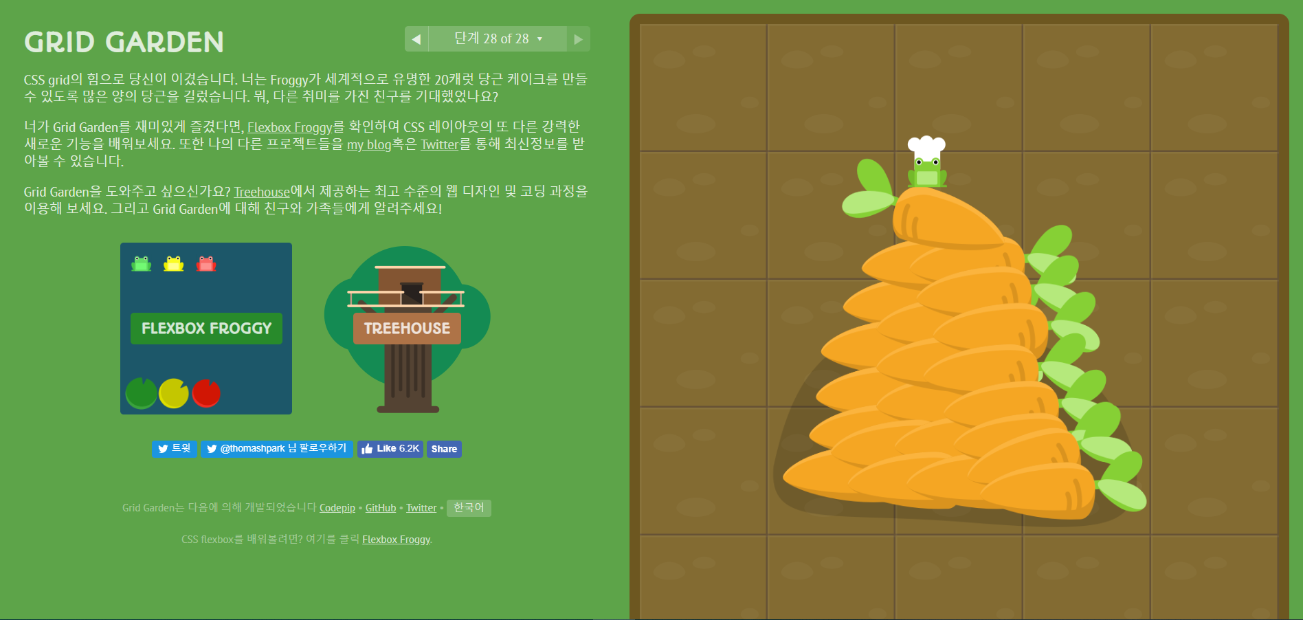
grid-garden풀면서 조금 이해도 높힘
'공부 > TIL' 카테고리의 다른 글
| 추상화, 실수, python 입문 (0) | 2019.04.18 |
|---|---|
| 컴퓨터 전반적인 내용들 (0) | 2019.04.17 |
| TIL: 레이아웃의 변천사 (0) | 2019.04.15 |
| TIL:애니메이션 기법배우기 (0) | 2019.04.14 |
| TIL:최신 웹 브라우저를 위한 모던 레이아웃 기법 (0) | 2019.04.13 |